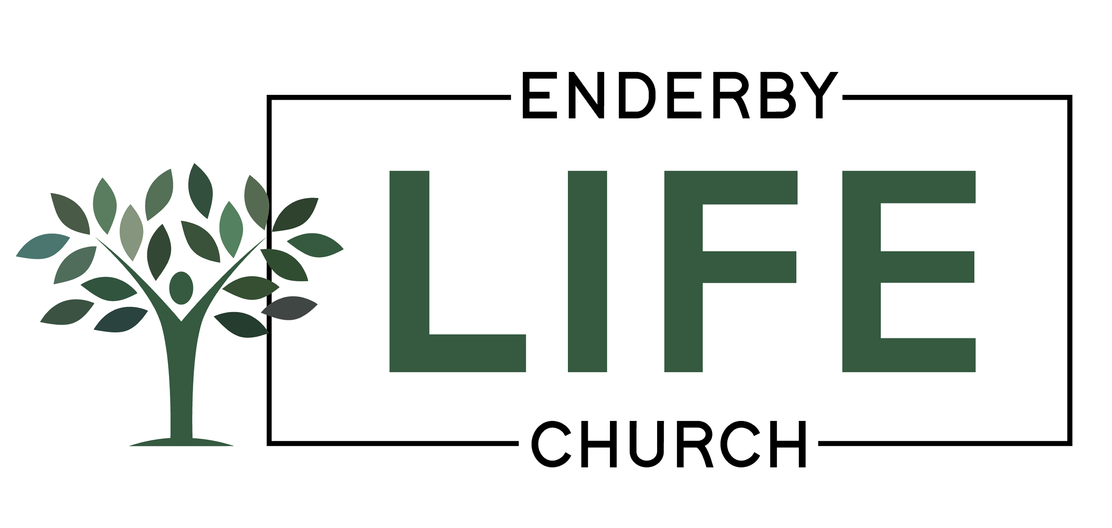
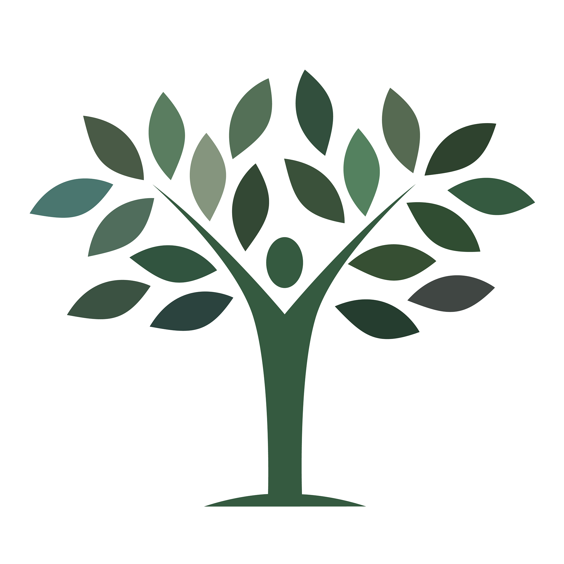
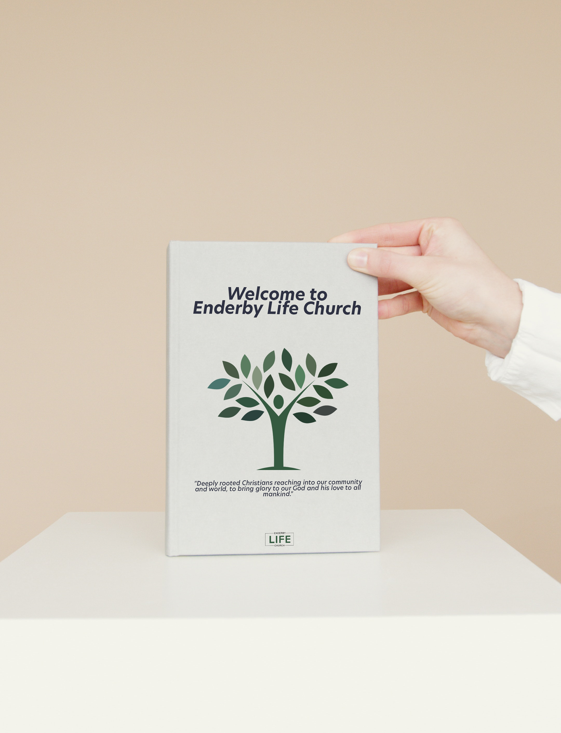
Visual branding for a local church. Client wanted the main focus to be around life (using the symbol of a tree), and loving people. This icon was born from the concept of a person with open arms to represent loving people, acting as the trunk of the tree, showing that this is a deep rooted belief. The colour scheme, chosen by the client, is another indication towards the symbolism of life.