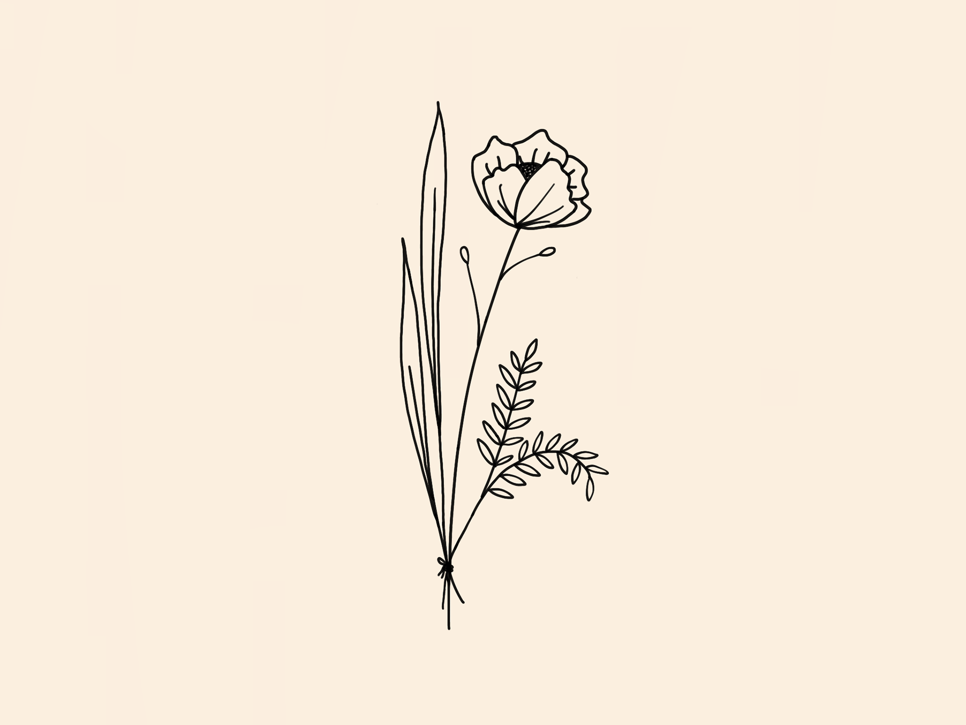
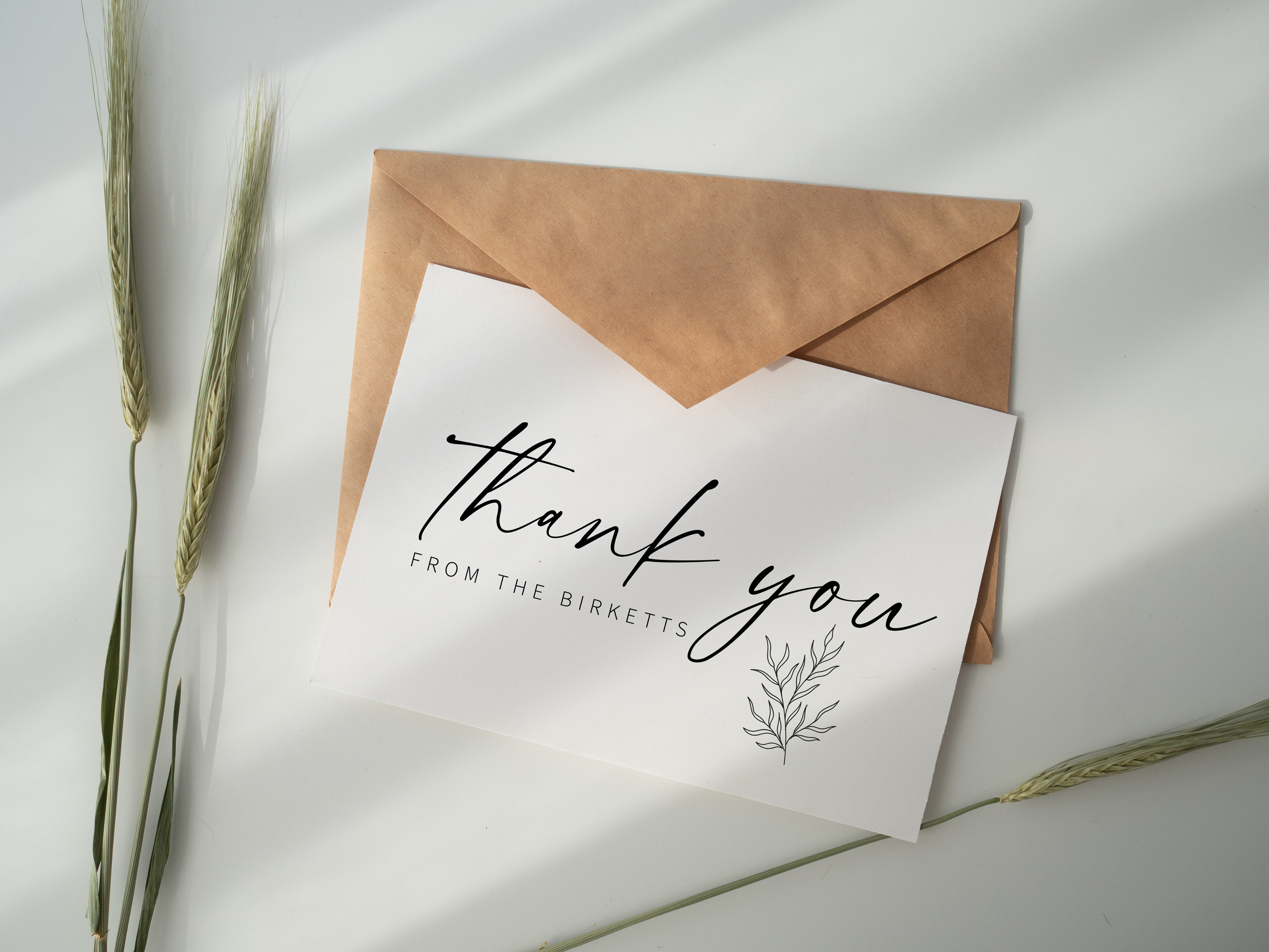
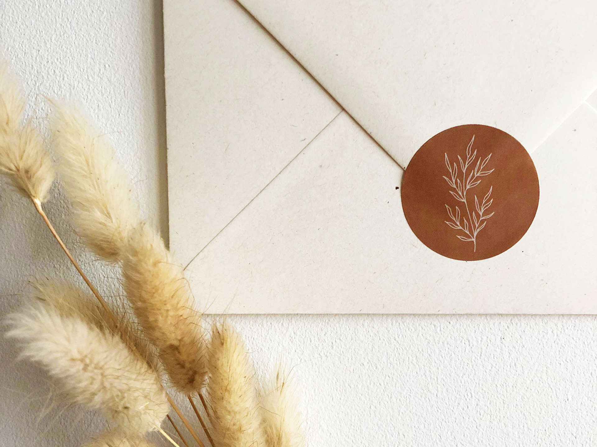
Visual branding for a handmade jewellery company. Client creates handmade jewellery using dried flowers and plants. The client’s target audience being predominantly female, the arch gives a softer feminine feel and helps to pull the logo together. The typeface gives the feel of a luxury brand, and the leaf design leans towards the nature of the business as well as a feminine feel.